 Software Development
 Security Services
 Cloud Services
 Other Services


 TechMagic Academy
Accessible UX for Healthcare: Designing for Life, Not Just Compliance

Sviatoslav Nytka
UI/UX Designer at TechMagic with a passion for visually stunning interfaces. Proven speaker. Guided by creativity, empathy, and data-driven design.

Anna Solovei
Content Writer. Master’s in Journalism, second degree in translating Tech to Human. 7+ years in content writing and content marketing

Accessibility isn’t the same in different fields. Sometimes, it is more complex and has higher stakes. In this piece, we talk about what makes healthcare UX so tricky, where standard guidelines fall short, and how to design with real people in mind.
When we talk about accessibility in healthcare industry, we’re helping people access life-critical services when they’re often under stress, in pain, or unsure of what to do next. That alone sets healthcare apart from other industries.
Unlike other sectors, healthcare products have the highest percentage of users with disabilities, according to research by the National Academies. That’s why accessibility in healthcare UX isn’t optional. And more than that, it demands a unique approach: professional and very careful.
We asked Anna Cherepantseva, a product designer and certified accessibility specialist, to share her thoughts on designing healthcare tools that actually work for everyone.

The Pressure is Different in Healthcare
Picture this: someone with anxiety is trying to find a specialist or review lab results, but the font is too small, or the button doesn’t work on their screen reader. In most industries, that’s a poor user experience. In healthcare, it could mean missed care or even worse.
That’s why clarity comes first. Healthcare information is often complex, full of medical terminology and critical instructions. If users can’t understand or act on that information, the consequences can be severe. Plain language, clean layout, and clear navigation aren’t just good practice here. These are safety features.

A critical factor is clarity since healthcare involves complex medical terms and lots of information, and misunderstanding can lead to serious problems. Content needs to be presented simply, in plain language, so anyone can easily understand and act upon it, not just medical professionals.
Privacy and independence are also important. Users must comfortably manage sensitive tasks like scheduling appointments or viewing medical records on their own, without revealing personal information to others.
Unique Challenges in UX Design for Healthcare
Designing for healthcare goes far beyond creating a smooth user flow. At its core, it’s about safeguarding people’s health and well-being. That’s what makes UX in this field uniquely complex.
High stakes and critical impact
Healthcare products directly influence vital aspects of people’s lives, including medication dosing, treatment schedules, rehabilitation, and ongoing care. A poorly designed interface can lead to confusion, delays in treatment, or even critical medical errors.
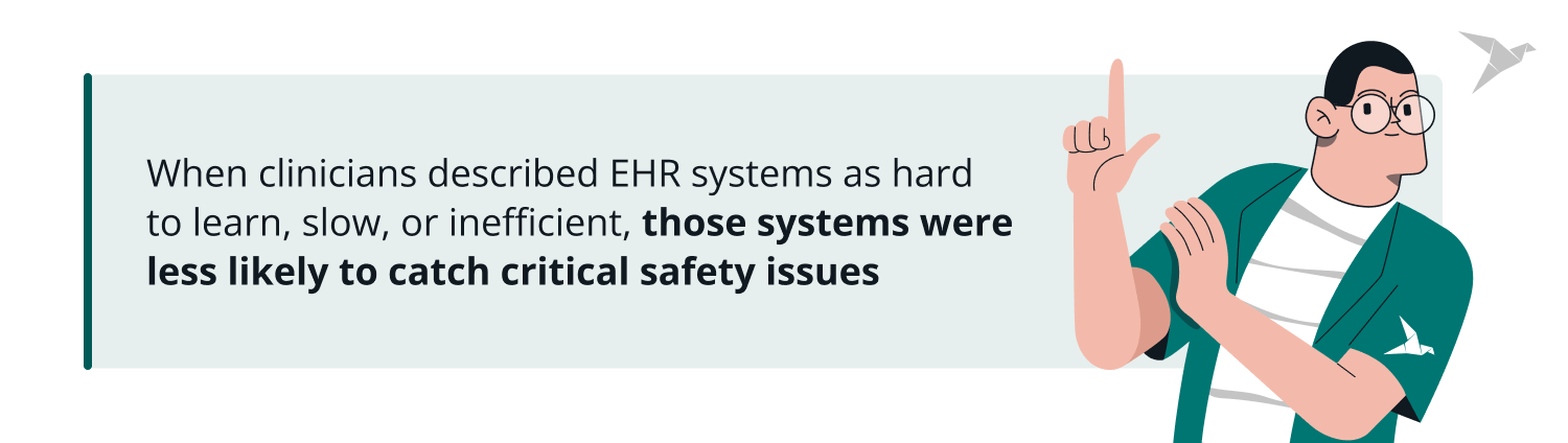
For instance, a study published in JAMA Network Open examined Electronic Health Record (EHR) systems in 112 U.S. hospitals, comparing safety data with survey responses from more than 5,600 clinicians. The findings were clear. When clinicians described EHR systems as hard to learn, slow, or inefficient, those systems were less likely to catch critical safety issues such as drug interactions, patient allergies, or duplicate orders.
The report pointed to a lack of consistent quality control and the absence of EHR usability and safety standards. Because hospitals often modify EHR or other healthcare systems to meet their internal workflows, some configurations may inadvertently reduce safety even if providers believe the systems are functioning well.
Complex workflows and diverse user needs
Healthcare products are not simple systems. They often include multi-level navigation, dense data grids, long forms, and workflows that serve various user groups: patients, caregivers, clinicians, and administrators.
Every interface must account for different levels of digital literacy and diverse accessibility needs. In the U.S. alone, 1 in 4 adults lives with a disability, making accessible healthcare UX design a baseline requirement.

Regulatory constraints and design freedom
Another challenge lies in balancing regulation with innovation. Healthcare UX teams must work within frameworks like the Health Insurance Portability and Accountability Act (HIPAA), the European Accessibility Act, or other standards. All while still trying to deliver simple, user-friendly experiences.
A unique opportunity ahead
Despite these challenges, healthcare offers UX professionals a meaningful opportunity to design products that are not only usable and inclusive but genuinely life-changing. A clear, accessible interface can support better health outcomes, empower users to manage their care, and build trust in digital health services. The more thoughtful the design, the higher the impact.
But here’s the opportunity: because the stakes are so high, meaningful improvements in UX can lead to powerful outcomes. A well-designed interface doesn’t simply improve satisfaction. It can reduce hospital readmissions, increase treatment adherence, and help people manage their health more independently.
Guidelines for Healthcare User Experience Design
Creating healthcare products everyone can use regardless of ability requires clear, simple guidelines. Let’s take a look at foundational guidelines for UX design in healthcare.
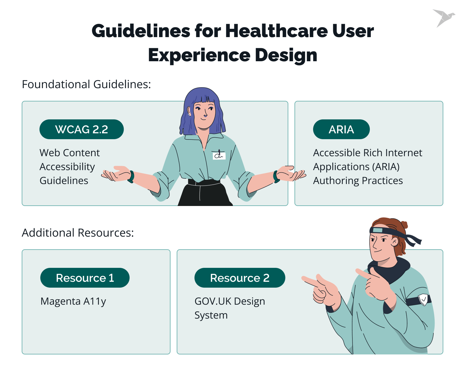
Web Content Accessibility Guidelines (WCAG 2.2)
The WCAG 2.2 guidelines are the basis for making web content accessible to people with disabilities. They focus on four principles: Perceivable, Operable, Understandable, and Robust.
These principles ensure that content is easy to see, use, and understand, regardless of the user’s abilities. For healthcare, following the AA level of WCAG is vital. This includes making text readable, providing alternatives for images, and ensuring that users can navigate and interact with healthcare tools without barriers.
Accessible Rich Internet Applications (ARIA) Authoring Practices
The ARIA Authoring Practices help developers make interactive content, like buttons, forms, and menus, accessible to users who rely on assistive technologies like screen readers.
Using ARIA attributes, such as ARIA labels and roles, ensures that everyone can use complex healthcare forms and interactive elements. When properly implemented, ARIA helps people navigate healthcare applications more easily, improving their experience.
Additional resources
There are two more useful resources for accessible design creation.
GOV.UK Design System
The GOV.UK Design System is a straightforward document for everyone who works on UK-based government projects. They ensure government services like healthcare portals are accessible to all users and consistent.
It focuses on clarity and ease of use, offering practical advice on designing simple forms, clear navigation, and easy-to-read content. Healthcare teams can follow this system to ensure that digital healthcare services are usable and inclusive, making it easier for all users, including those with disabilities, to access the information they need.
Magenta A11y
The Magenta A11y is a checklist developed by T-Mobile. It helps organizations test Web, iOS, and Android components for usability. It sets high standards for accessibility, particularly for interactive features like forms and buttons.
In healthcare, adopting Magenta A11y ensures that patients using healthcare apps can easily book appointments, view medical records, or refill prescriptions. Whether they have visual impairments, limited mobility, or other accessibility needs.
One-size-fits-all guidelines don’t go far enough
My team and I always keep in mind that the best way to ensure a product is accessible is to test it with users who have disabilities. But if we are talking about actions before accessibility testing, then I begin with using the WCAG as a foundational reference.
However, in healthcare, even that strong foundation may fall short. The minimum target size for AA (24×24 px, which is often too small) defined in WCAG, for example, might not meet the needs of all users in real-world scenarios.
Experienced healthcare designers go beyond the checklist. For each product, I document specific accessibility requirements as part of the design system, ensuring that all team members can contribute.
Additionally, my team and I have found WCAG documentation difficult to navigate, so I created a more structured version that presents the success criteria in a checklist format. It includes links to the original success criteria details, summary trackers, and filters for better flexibility. I also made this resource publicly available, hoping it will help everyone create more accessible digital products.
Testing with real users
Accessibility testing with real users is what makes it work. We put our designs in the hands of people with disabilities to answer real questions: Can someone with color blindness read our charts? Can a screen reader user book an appointment solo? Can a visually impaired person pull up lab results from a PDF?
If yes, we’re on track. If not, we tweak until it’s right. In healthcare, testing isn’t optional. This is how we know the tools won’t let anyone down when it matters most.

Regular internal and external testing with diverse user groups helps make sure the final product actually meets a wide range of user needs, not just the minimum accessibility requirements.
Designing with Inclusivity in Mind
But you should keep in mind that healthcare products should go beyond accessibility alone and take into account inclusivity in general. In healthcare, for example, this means designing for people with low digital literacy, spotty connectivity, and outdated devices (including medical devices).
DataReportal shared that between 2015 and 2022, nearly 3 billion people worldwide got online for the first time – and changed the internet in the process. Google even introduced a specific term for such users, calling them "Next Billion Users" (NBU).
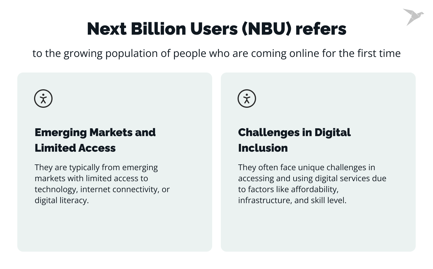
They may have limited access to the internet or newer smartphones. They may not be familiar with multi-step forms or account creation flows.
To support these users, healthcare designers have to think holistically: use fewer steps, build offline-friendly features, minimize file sizes, and reduce cognitive load. And again, testing is key. It’s not enough to assume a design works. You have to put it in the hands of the people who’ll use it.
A visual compromise? Not at all
There’s a common myth that accessible design looks bland. But thoughtful healthcare UX shows that you can have both: visual polish and full accessibility.

Balancing visual appeal and accessibility usually comes down to thoughtful choices. Animations, for example, can add value if users have a simple way to pause or turn them off. If your brand uses low-contrast colors for style, offering a high-contrast mode can make the design more accessible without losing its visual identity.
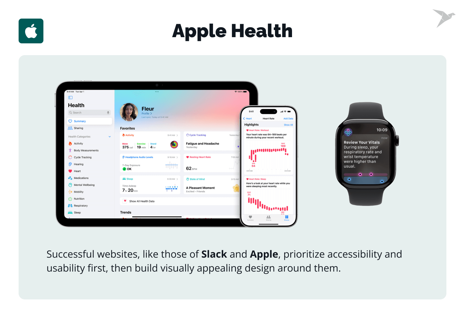
A visually appealing website won’t be useful if people can’t interact with it comfortably. It often works well to start with accessibility, build on that with usability, and then shape the visual layer around both. Companies like Slack or Apple are good examples of this approach. They’re known for visually pleasing, modern product design, but they also take accessibility seriously.
What’s Next?
The future of accessibility in healthcare is a promise. A promise that every patient, no matter their abilities, can use the tools meant to help them heal.
One of the main aspects that will shape accessibility in the coming years will be regulatory requirements. Regulations like the European Accessibility Act (EAA) or Americans with Disabilities Act (ADA) will ensure that businesses provide products with equal access for all users.
In the UX Time podcast, Slava Shestopalov, a design manager with over 14 years of experience, sees this as more than a rule to follow. It’s a push, a force that’s making businesses rethink how they design. He predicts accessibility will become a must-have skill, something every designer brings to the table, not just a few specialists.
Accessibility means building tools that truly fit people (like a telemedicine app that’s simple for a senior with shaky vision or a patient who can’t tap a screen). It’s not enough to meet the minimum; the goal is trust, making sure every user feels seen and supported. That takes fresh ideas: maybe voice controls for those who can’t touch or tech that adapts to you, not the other way around. Regulations like the EAA are lighting the way, sparking new ways to test and create.
For businesses, this is a chance to shine. It is a way to stand out, reach more people, and make something better, not just compliant. Healthcare companies that get this right will lead. And it’s bigger than healthcare alone. Accessibility is growing into a norm, spreading to other fields as rules and demand keep rising. It’s a shift in how we think, a culture where design doesn’t exclude.
The takeaway? Accessibility in healthcare is heading toward something human. It’s about tools that don’t just work but feel right: intuitive, inclusive, yours.
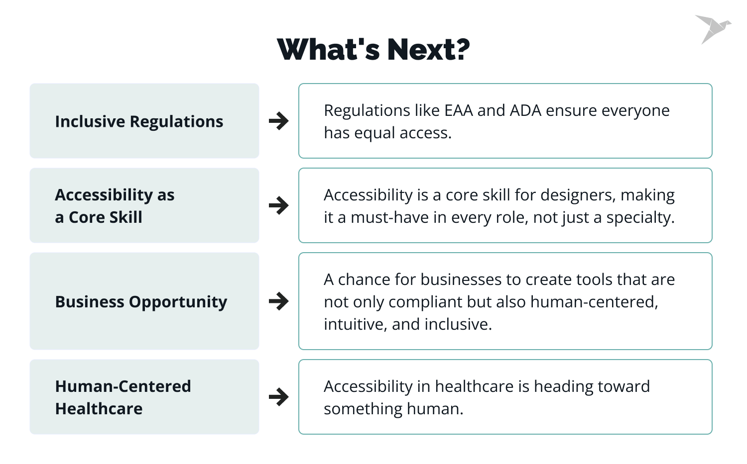

Designers will need stronger accessibility skills, as it becomes part of everyday work rather than a specialized task, as more and more vacancies start including this requirement in job descriptions. Many companies are also shifting from treating accessibility as a one-time project to building it into regular design processes, which also means that, to be a strong competitor, you should take accessibility into consideration.
-
What makes UX design different in the healthcare sector from other industries?
Healthcare UX design is unique because it directly impacts people's health and well-being. Unlike other industries, healthcare products often serve users in high-stress situations, and poor design can have severe consequences. This requires a more thoughtful, accessible, and user-centered approach to ensure safety and ease of use. Healthcare professionals rely on effective design to access complex medical information quickly (through clearer medical forms or data visualization in healthcare apps), ensuring better outcomes for patients.
-
How can healthcare UX design impact patient care?
Effective healthcare UX design improves the way patients interact with medical tools and services, leading to better engagement, easier access to patient data, and improved care. Clear navigation, easy-to-read content, and simple interactions can help patients manage their health more effectively and reduce the risk of errors in using digital health tools. This makes a significant difference in patient care, ensuring critical data is accessible when it matters most..
-
What are the key accessibility guidelines for healthcare UX?
The Web Content Accessibility Guidelines (WCAG) 2.2 are essential for making web content accessible to people with disabilities. Healthcare products should follow these guidelines to ensure text is readable, images have alternatives, and users can navigate and interact without barriers. Additionally, using ARIA (Accessible Rich Internet Applications) helps make interactive elements accessible for screen readers and other assistive technologies. These guidelines help healthcare UX designers create more intuitive and inclusive experiences for users.
-
How do you test accessibility in healthcare UX?
Testing accessibility in healthcare UX involves real users with disabilities. It’s essential to test designs with individuals who have different accessibility needs, such as colorblindness or limited mobility, to ensure that they can easily navigate the interface, book appointments, or access critical health data independently. Real-world testing helps healthcare providers ensure the designs meet the diverse needs of users.
-
How can healthcare organizations ensure their products are accessible?
Healthcare organizations should adopt accessibility best practices, such as following WCAG guidelines, using ARIA attributes for interactive elements, and conducting regular accessibility testing with real users. By integrating accessibility into the design process from the beginning, they can create products that are truly usable for all. This approach benefits both patients and healthcare professionals, ensuring everyone can easily access and manage medical data.


 linkedin
 facebook
 twitter


